FUGUE GRAPHIC STANDARDS MANUAL
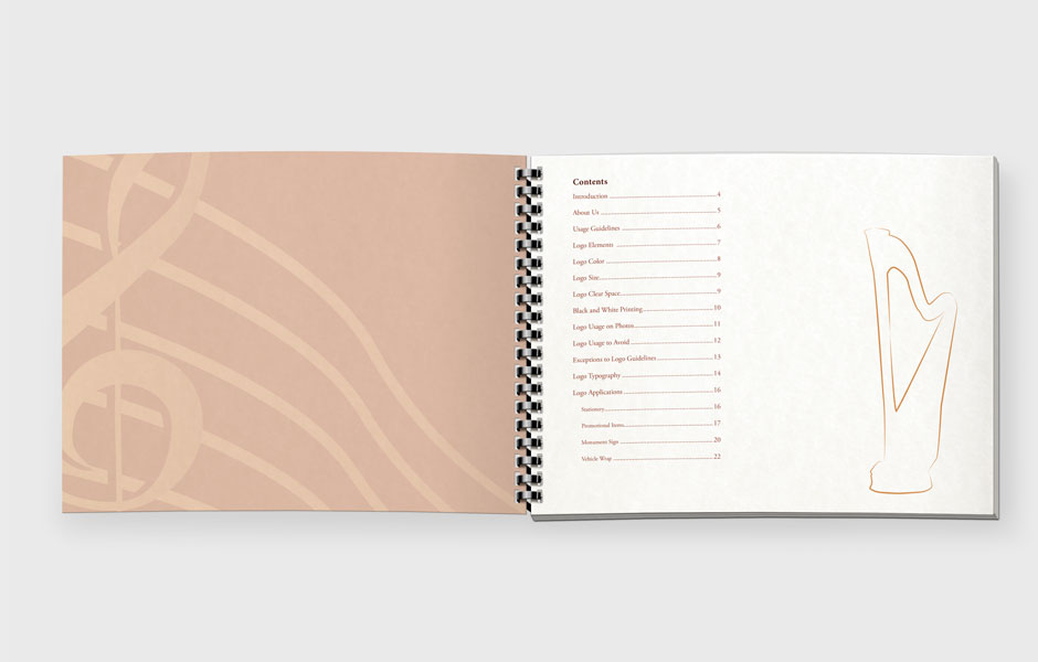
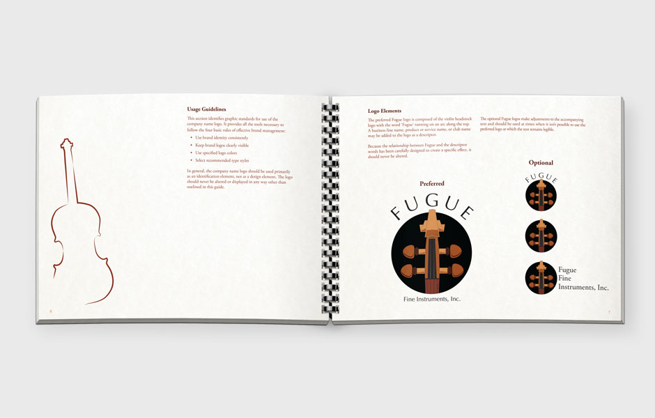
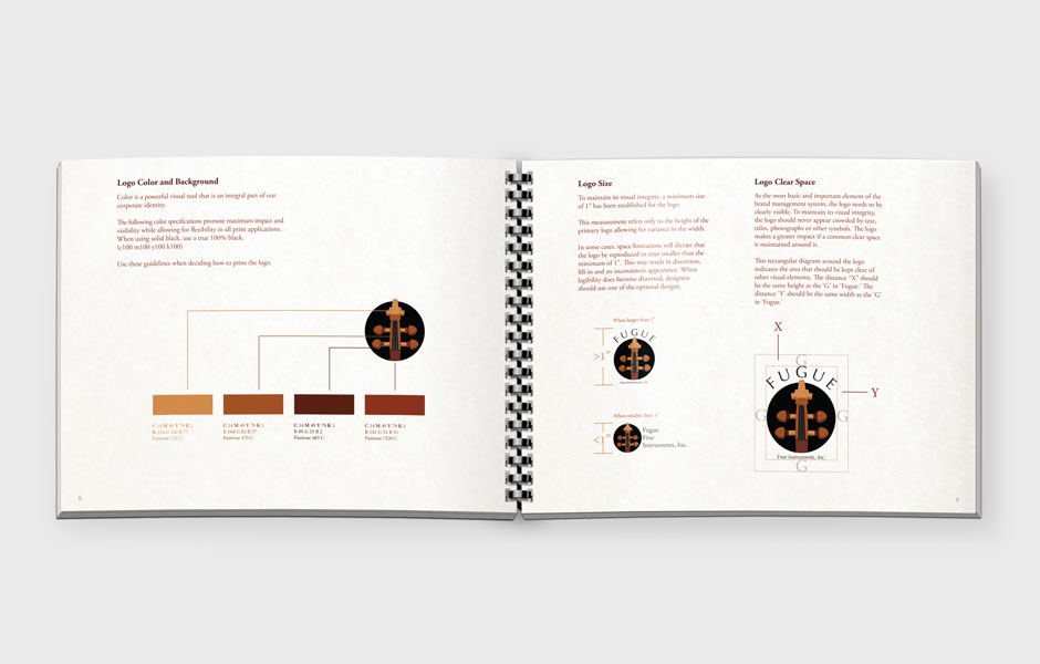
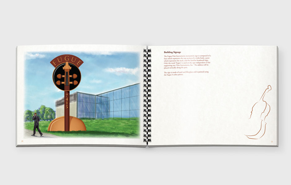
This graphic standards manual needed to have a somewhat artisanal look, but still be fairly sophisticated. Staying within the brand, the browns for the logo were used throughout, and a classic serif font was used for the type. Simple illustrations of the instruments were created to fill in excessive white space, and a heavy, textured paper was used for the pages.


